contract_address = "0x6b175474e89094c44da98b954eedeac495271d0f"
topic0 = "0xddf252ad1be2c89b69c2b068fc378daa952ba7f163c4a11628f55a4df523b3ef"
amount_scale = 1e18Ethereum Transfers Heatmap
Observe hidden patterns in token transfers
ethereum
data
This work is heavily inspired by the amazing visualizations of bitcoin inputs/outputs at utxo.live.
I’ve replicated it by plotting 2.1 billion native ether transfers.
This post will apply the same method to ERC20 token transfers, so you can follow along with your favortite token and without needing a large transfers dataset.
We will be using jupyter, cryo, polars, matplotlib, datashader, altair. You will learn how to render billions of data points and how to display them properly.
Ethereum data
We’ll make a heatmap of amount distribution among 18.3 million DAI transfers on Ethereum mainnet.
If you want a larger dataset, you can try USDC (73.3 million), BTC UTXO (129 million), USDT (206 million transfers) or native ether transfers (2.1 billion).
If you have cryo logs (125 GB) dataset available, you can slice a subset from it, filtering by contract_address and topic0.
You can also get it ad hoc using cryo. We only require block_number and data columns, with data encoding the amount sent.
If you want to plot native ether transfers, you would need cryo transactions (304 GB) dataset.
Imports and configs
import cryo
import numpy as np
import polars as pl
import cmasher
from IPython import display

pl.Config.set_tbl_hide_column_data_types(True)
pl.Config.set_tbl_hide_dataframe_shape(True)from eth_utils import decode_hex
raw_transfers = (
pl.scan_parquet("~/data/logs/*.parquet")
.filter(
(pl.col.contract_address == decode_hex(contract_address))
& (pl.col.topic0 == decode_hex(topic0))
)
.select("block_number", "data")
)cryo.freeze(
"logs",
contract=contract_address,
topic0=topic0,
align=True,
chunk_size=100000,
columns=["block_number", "data"],
sort=["block_number"],
output_dir="cryo_logs",
)
raw_transfers = pl.scan_parquet("cryo_logs/*.parquet")raw_transfers = (
pl.scan_parquet("~/data/transactions/*.parquet")
.filter(pl.col.value != "0")
.with_columns(amount=pl.col.value.str.to_decimal().cast(pl.Float64()) / 1e18)
.select("block_number", "amount")
)First, export the outstanding coins with bitcoin-utxo-dump.
bitcoin-utxo-dump -f height,amountThen, extract block timestamps from LevelDB using python-bitcoin-blockchain-parser and join them with the coins.
from os.path import expanduser
from blockchain_parser.blockchain import Blockchain

blocks = []
blockchain = Blockchain(expanduser("~/.bitcoin/blocks"))

for block in blockchain.get_ordered_blocks(expanduser("~/.bitcoin/blocks/index")):
    blocks.append((block.height, block.header.timestamp))

blocks = pl.DataFrame(blocks, schema=["height", "timestamp"])
utxo = pl.read_csv("utxodump.csv")

decoded_transfers = (
    utxo.join(blocks, on="height").sort("height").rename({"height": "block_number"})
)
Decode the amounts from data column using map_batches. If your machine can’t fit the whole column into memory, you can try your luck with map_elements.
def decode_amounts(series):
    return pl.Series(
        "amount",
        [int.from_bytes(item, "big") for item in series],
        dtype=pl.Float64,
    )


decoded_transfers = raw_transfers.select(
    "block_number",
    amount=pl.col.data.map_batches(decode_amounts) / amount_scale,
).collect()
Heatmap size
We need to decide on the heatmap size early, because the bucket sizes would depend on it. Let data inform our decision.
The x axis would show the timestamp, so we need to know the date range to pick an appropriate interval.
To do this, we look up timestamps from cryo blocks (0.86 GB) dataset.
blocks = (
    pl.scan_parquet("~/data/blocks/*.parquet")
    .select(
        block_number="number",
        timestamp=pl.from_epoch("timestamp"),
    )
    .collect()
)
decoded_transfers = decoded_transfers.join(blocks, on="block_number")
print(len(decoded_transfers), 'transfers')
18348925 transfersinterval = "1d"
time_span = decoded_transfers.select(
min=pl.col.timestamp.first(),
max=pl.col.timestamp.last(),
).with_columns(
pl.all().dt.truncate(interval).suffix("_t"),
span=pl.col.max - pl.col.min,
)
time_range = pl.datetime_range(
time_span[0, "min_t"], time_span[0, "max_t"], interval, eager=True
)
time_span.select("min", "max", "span")| min | max | span |
|---|---|---|
| 2019-11-13 21:22:33 | 2023-09-24 09:34:59 | 1410d 12h 12m 26s |
The data spans 1410.5 days, a 1 day interval sounds fitting. We generate a datetime range to avoid any off-by-one errors later.
For the y axis, we would likely want a log scale. We look up the range in the data, but choose the extents ourselves.
amount_span = decoded_transfers.filter(pl.col.amount > 0).select(
    min=pl.col.amount.min(),
    max=pl.col.amount.max(),
    min_log=pl.col.amount.min().log(10),
    max_log=pl.col.amount.max().log(10),
)
amount_span| min | max | min_log | max_log |
|---|---|---|---|
| 1.0000e-18 | 5.4545e8 | -18.0 | 8.736753 |
golden = (1 + 5**0.5) / 2
aspect = golden
width = len(time_range)
height = int(width / aspect)
buckets = np.logspace(-2, 8, height)
width, height
(1412, 872)Heatmap data
Polars has a very handy cut method for binning values into buckets. We count the number of transfers with the amount falling in every bucket on each day.
For amounts exceeding the bucket range, polars uses a float("inf") break, which wouldn’t work with datashader. We fix this in the last step, as well as zero out the lowest bucket, as it includes all lower values, which makes it not very useful.
transfer_stats = (
    decoded_transfers.with_columns(
        bucket=pl.col.amount.cut(buckets, include_breaks=True),
    )
    .sort("timestamp")
    .group_by_dynamic("timestamp", every=interval)
    .agg(
        txs_per_bucket=pl.col.bucket.struct.field("brk").value_counts(),
    )
    .explode("txs_per_bucket")
    .unnest("txs_per_bucket")
    .rename({"brk": "bucket", "counts": "num_txs"})
    .with_columns(
        bucket=pl.when(pl.col.bucket == float("inf"))
        .then(buckets[-1])
        .otherwise(pl.col.bucket),
        num_txs=pl.when(pl.col.bucket == buckets[0]).then(0).otherwise(pl.col.num_txs),
    )
)
print(len(transfer_stats), "datapoints")
837412 datapointsMatplotlib
With these data points we can plot the data. You can’t really use your regular charting methods when dealing with millions of points.
But what is a heatmap if not a colormapped raster image? We could try to construct the image from our dense data, looking up x coordinates from time_range and y coordinates from buckets.
To add the properly labeled ticks, we do a reverse translation from x and y coordinates to timestamp and buckets. We would override the tick labels with our computed values.
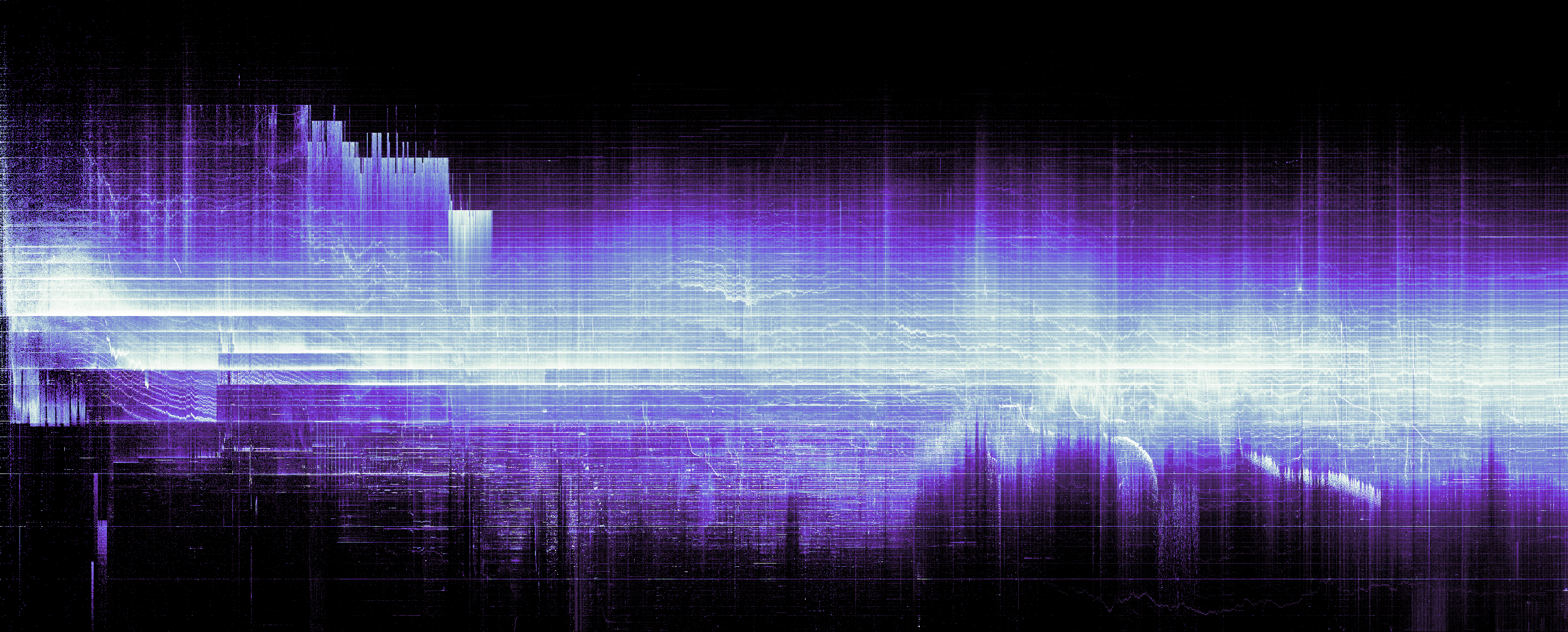
To render the image, we could use something like imshow from matplotlib. It will appear very dim, so you would want to adjust the data or do some colormap normalization1.
More search might bring a different approach with histogram equalization2 from scikit-image to finally arrive at a decent result.
If you try to add the axes, you would quickly learn that matplotlib was not designed to deal with exact dimensions. For some reason, it measures everything in inches. Moreover, if you try to rescale the axes, it would squish the image, and we want to blip the heatmap on the chart as is. There is plt.figimage, but it doesn’t work with 2x resolution and you would need to calculate the offset (in pixels this time) by hand.
Below I present an easier method, which relies on an obscure combination of options. If you create a figure the size of the image and then add the axes with zero margin, the image would be pixel perfect, but the axes would be outside frame. When saving an image, you can set bbox_inches='tight' and matplotlib would expand the output image to reveal the axes.
See matplotlib code
from matplotlib import pyplot as plt
from skimage.exposure import equalize_hist

%config InlineBackend.figure_format = 'retina'

# convert timestamps to x coordinates and buckets to y coordinates
date_to_x = (
    pl.DataFrame({"timestamp": time_range})
    .with_row_count()
    .rename({"row_nr": "x"})
)
bucket_to_y = (
    pl.DataFrame({"bucket": buckets})
    .with_row_count()
    .rename({"row_nr": "y"})
)
source = (
    transfer_stats
    .join(date_to_x, on="timestamp")
    .join(bucket_to_y, on="bucket")
)
# convert datapoints to image
x = source["x"].to_numpy()
y = source["y"].to_numpy()
w = source["num_txs"].to_numpy()
H, xe, ye = np.histogram2d(x, y, weights=w, bins=[width, height])
# match the figure size with the image size
dpi = 120
fig = plt.figure(figsize=(width / dpi, height / dpi), dpi=dpi)
fig.add_axes((0, 0, 1, 1), frame_on=False)
# note: histogram2d flips the cartesian coordinates
im = plt.imshow(equalize_hist(H.T), origin="lower", cmap=cmasher.freeze)
ax = plt.gca()
# y axis ticks
y_ticks = np.logspace(-2, 8, 11)
y_indexes = [np.where(buckets >= t)[0][0] for t in y_ticks]
ax.set_yticks(y_indexes, [f'$10^{{{int(np.log10(n))}}}$' for n in y_ticks])
# x axis ticks
dts = date_to_x.group_by_dynamic('timestamp', every='1q').agg(pl.col.x.first()).tail(-1)
x_ticks = dts['timestamp'].cast(pl.Date).to_list()
ax.set_xticks(dts['x'].to_numpy(), [f'{x.strftime("%b")}' + (f'\n{x.strftime("%Y")}' if x.month == 1 else "") for x in x_ticks])
plt.title('DAI transfer amount heatmap')
# this method works both for `show` and `savefig`
plt.savefig('heatmap-matplotlib.png', bbox_inches='tight')
plt.show()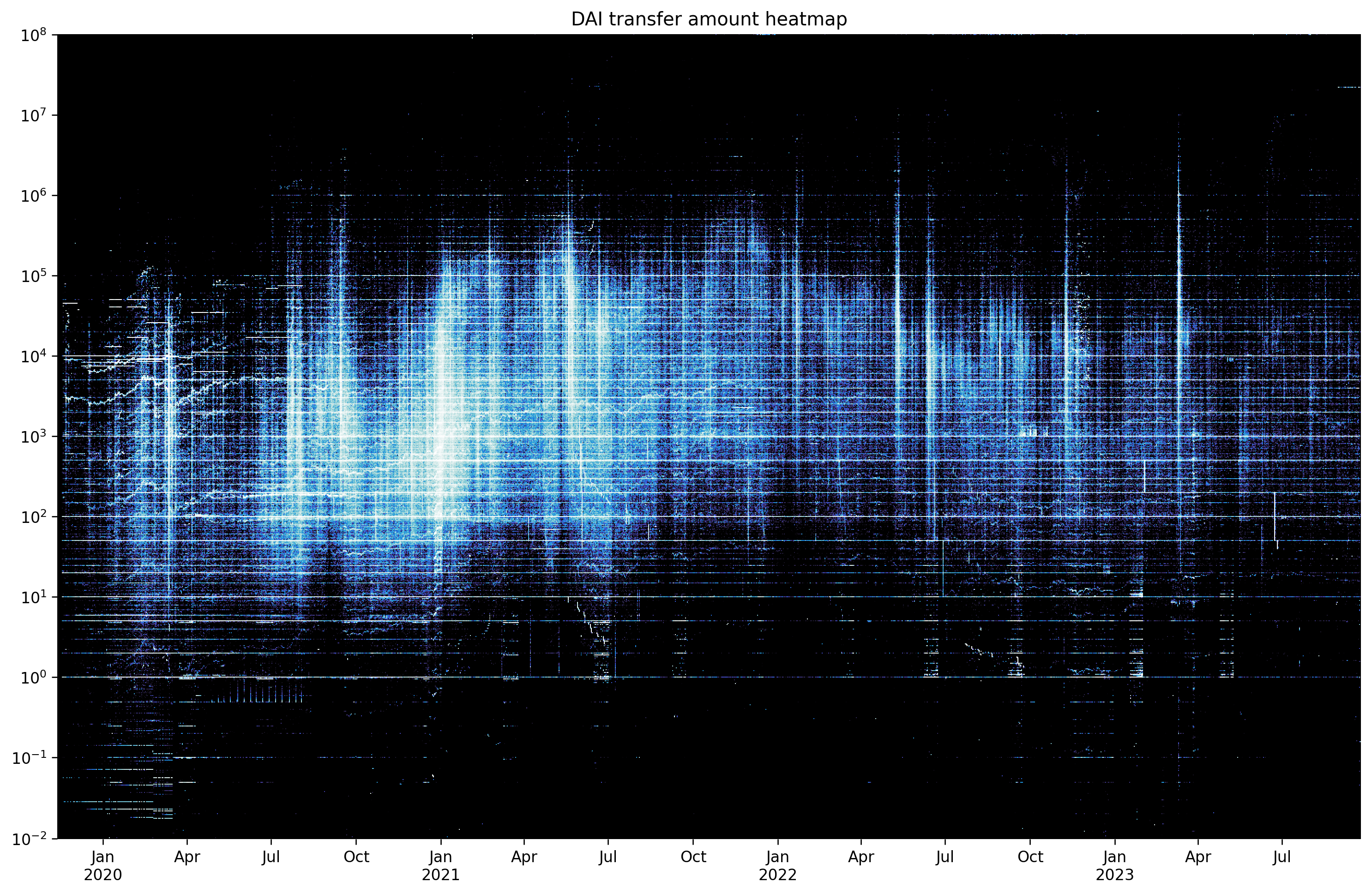
Datashader
But what if I told you there is a better way, which does much of this by default.
You know the devs are onto something when their tutorial starts from a chapter-long rant3 about all the bad charts people are making.
Their peers also have strong words (and a paper4) about colormaps matplotlib ships with. Instead, they recommend using a perceptually uniform colormap. Two such collections are colorcet and cmasher, the latter offers more artistic options.
We use datashader here, since it offers a pipeline flexible enough to render a billion points on a laptop.
First, convert the timestamps to float as required by xarray. Normalize the transaction counts by day using a window function so the image is more legible. If you want to use raw counts, change ds.sum("normalized") to ds.sum("num_txs").
Next, create a canvas and add the data points there. Datashader supports aggregation, so you can simply halve plot_width and plot_height and it would render a preview image for you. Fill untouched buckets with zeros, otherwise they would appear as transparent.
Verify the dimensions are correct using ds.count aggregation. If you see horizontal or vertical streaks, your sizes do not match up.
Finally, apply a colormap using tf.shade. It would normalize the values to better translate them to the colormap. By default, datashader uses histogram equalization how="eq_hist", a nice choice for a large dataset. It would spread out the values in a way that would occupy the full range of the colormap, bringing out the most contrast. Other options include linear (matplotlib default), logarithmic log, and cube root cbrt.
import datashader as ds
from datashader import transfer_functions as tf

df = transfer_stats.with_columns(
    pl.col.timestamp.cast(pl.Float64),
    normalized=pl.col.num_txs / pl.col.num_txs.sum().over("timestamp"),
).to_pandas()

canvas = ds.Canvas(plot_width=width, plot_height=height, y_axis_type="log")
points = canvas.points(df, "timestamp", "bucket", agg=ds.sum("normalized")).fillna(0)
heatmap = tf.shade(points, cmap=cmasher.freeze)
heatmap.to_pil().save("heatmap.png")
display.Image("heatmap.png")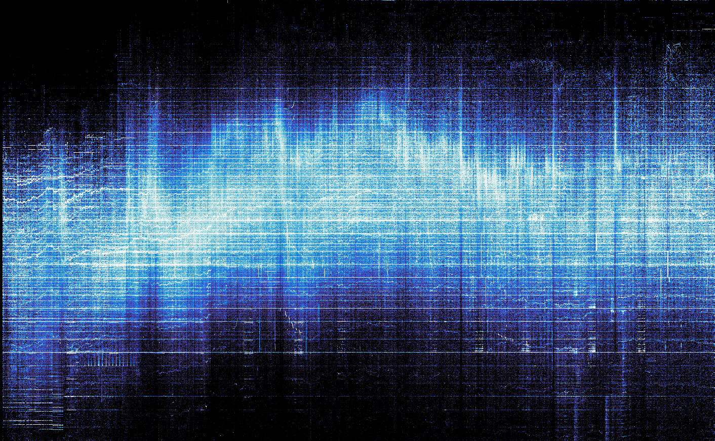
Altair
We have plotted 837,412 data points faster than you blinked. And datashader did a much better job than matplotlib utilizing the full range of the colormap.
Below I will show another way of adding axes to the image using altair.
Altair excels at layering and combining charts. We plot two points: one with the minimum coordinates where we blip the image, and another invisible point at the maximum coordinates. The chart size is halved so it renders better on a retina screen.
To render an image in altair, you specify an url, which doesn’t work with local images in a local jupyter easily. The workaround is to embed a base64-encoded image in the source data.
The upside of this approach is you have real axes now, which you can allow altair to render nicely instead of mapping the values by hand. The chart also looks crisp at any resolution because everything but the heatmap is vector, unlike matplotlib5.
5 matplotlib can render svg, but nobody uses this for some reason
See altair code
import io
import base64
import altair as alt

def xarray_to_base64(image):
    buffer = io.BytesIO()
    image.to_pil().convert("RGB").save(buffer, format="png")
    encoded = base64.b64encode(buffer.getvalue())
    return "data:image/png;base64," + encoded.decode()


extents = pl.DataFrame(
    {
        "timestamp": [transfer_stats[0, "timestamp"], transfer_stats[-1, "timestamp"]],
        "amount": [buckets[0], buckets[-1]],
        "image_data": [xarray_to_base64(heatmap), None],
    }
)

axes = (
    alt.Chart(
        extents.to_pandas().tail(1),
        title="DAI transfer amount heatmap",
        width=width // 2,
        height=height // 2,
    )
    .mark_point(opacity=0)
    .encode(
        alt.X("timestamp:T").axis(tickCount=10, labelExpr="[timeFormat(datum.value, '%b'), timeFormat(datum.value, '%m') == '01' ? timeFormat(datum.value, '%Y') : '']"),
        alt.Y("amount:Q").scale(type="log"),
    )
)

fill = (
    alt.Chart(
        extents.to_pandas().head(1),
    )
    .mark_image(width=width // 2, height=height // 2, align="left", baseline="bottom")
    .encode(alt.X("timestamp:T"), alt.Y("amount:Q"), alt.Url("image_data"))
)

(fill + axes).configure_axis(grid=False).configure_view(stroke=None)
Prior art
If you are interested in this type of visualizations, you should check out these projects:
- BitcoinUtxoVisualizer by martinus can produce a video6 that shows the evolution of bitcoin unspent transaction outputs set
- utxo-live by Unbesteveable can plot a heatmap by decoding UTXOs from a static
dumptxoutsetoutput.
6 watch here, last rendered in 2020